Nesaj is a high-quality housing product line from Retal, a leading Saudi real estate developer known for its exceptional craftsmanship and commitment to modern urban living. In partnership with the National Housing Company (NHC), Nesaj develops high-quality, affordable housing in six cities in Saudi Arabia.
The primary challenge was to reposition Nesaj’s ‘accessible housing’ developments away from typical trade-offs usually associated with cost-effective alternatives.
The Solutions
We delivered a comprehensive strategic and creative suite of solutions for Nesaj. Through collaborative workshops, we defined a clear brand strategy, developed verbal brand naming, and crafted a cohesive visual identity. This was then extended across various brand applications and publication materials.
Branding
Brand strategy
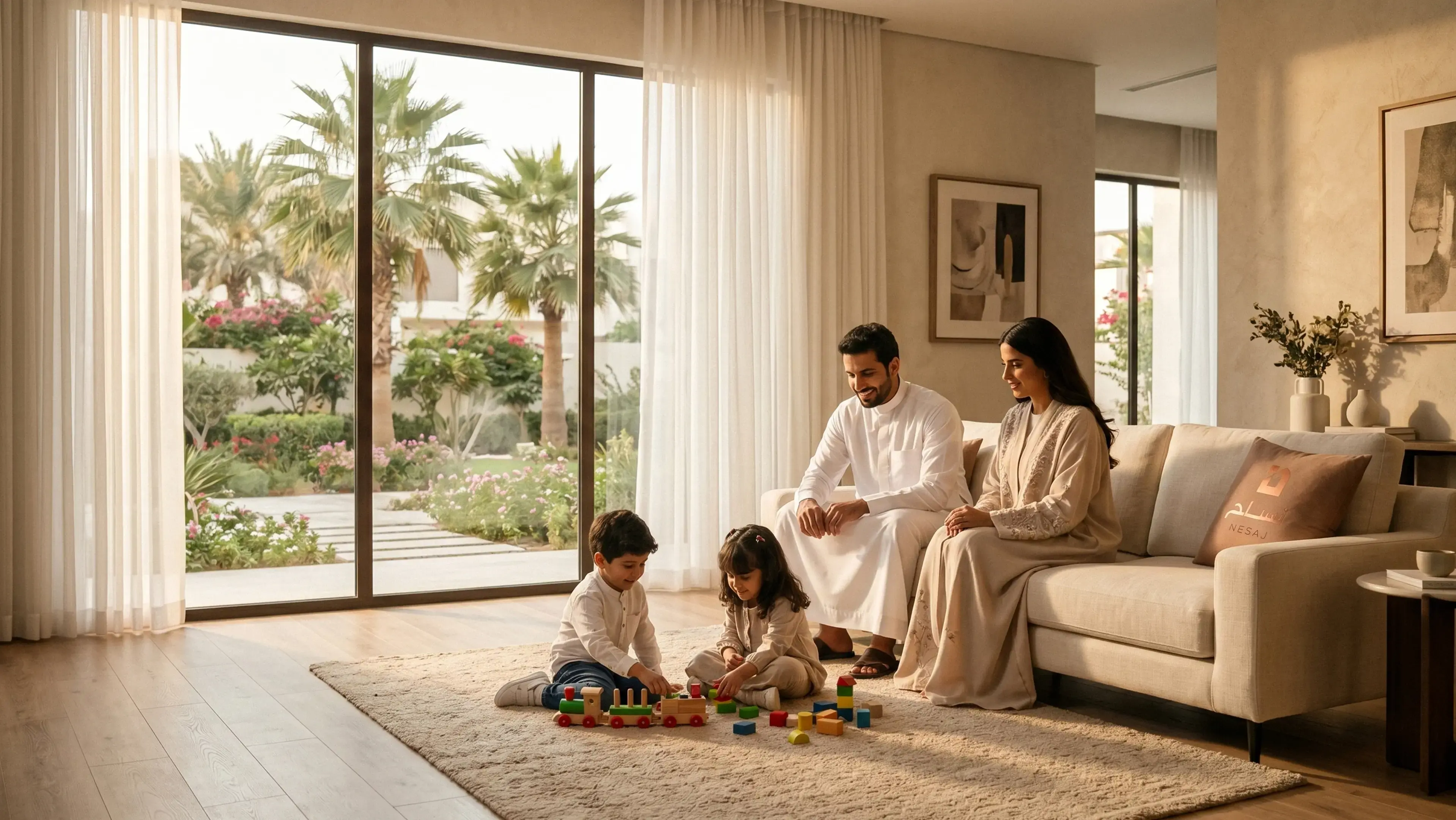
The strategic framework positioned Nesaj as a reliable bridge between aspiration and accessible homeownership, emphasising high-quality, enduring living experiences. Its core brand promise shifts the focus from a simple property transaction to fostering a community that supports an uplifting lifestyle.
Verbal Brand Naming
Based on the brand platform, we developed clear naming directions that captured the product line’s essence and aspirations. This led to the name ‘Nesaj’, Arabic for woven fabric, symbolising the interweaving of community, craftsmanship, and modern living.
Visual Brand Creation
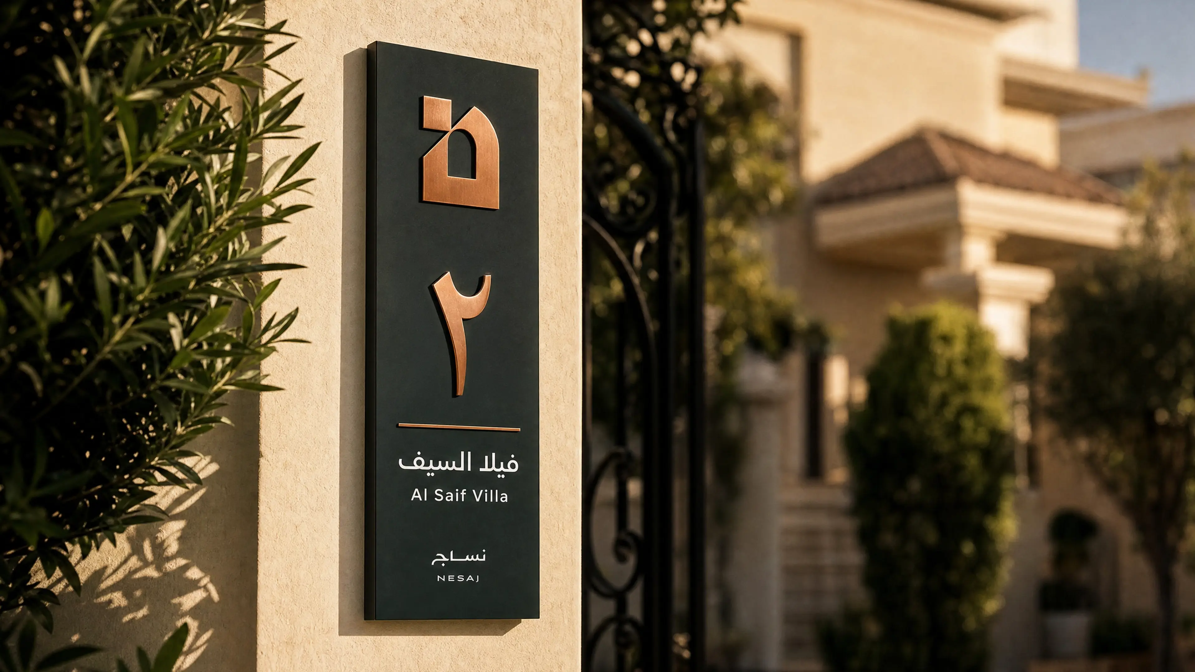
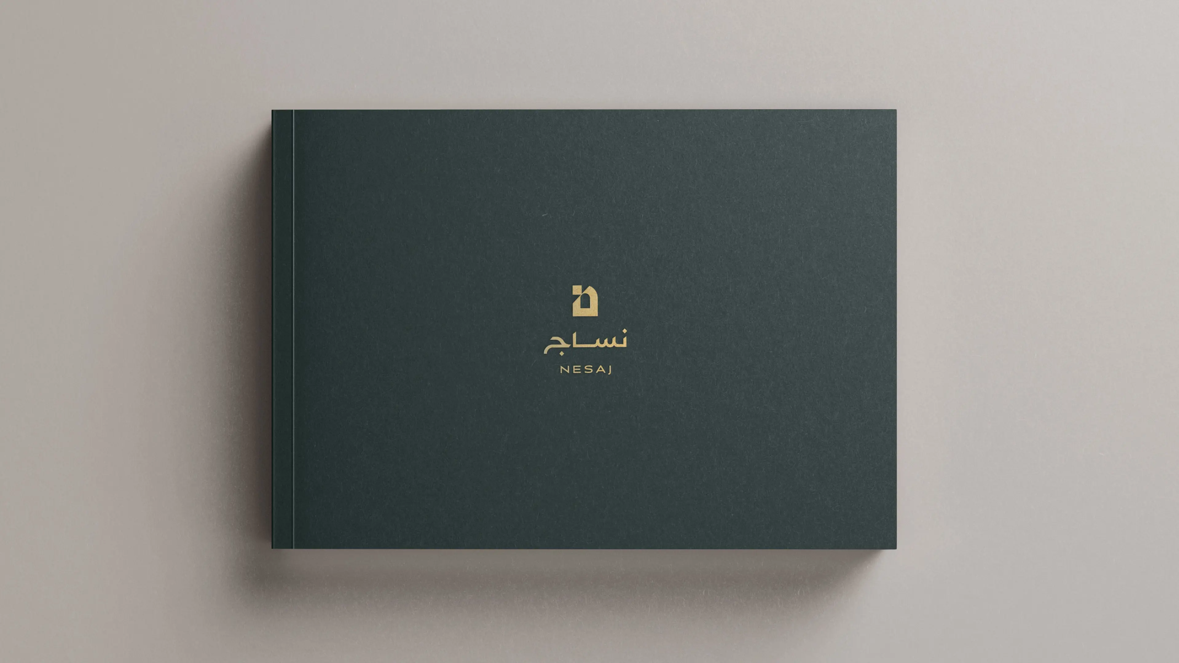
The Visual Brand Identity is anchored in two core elements: the Arabic letter ‘Noon’, representing Nesaj, and the arched window form. While the letter ‘N’ establishes a strong cultural and linguistic connection, the window symbolises openness, light, and the relationship between home and community.
Brand Applications
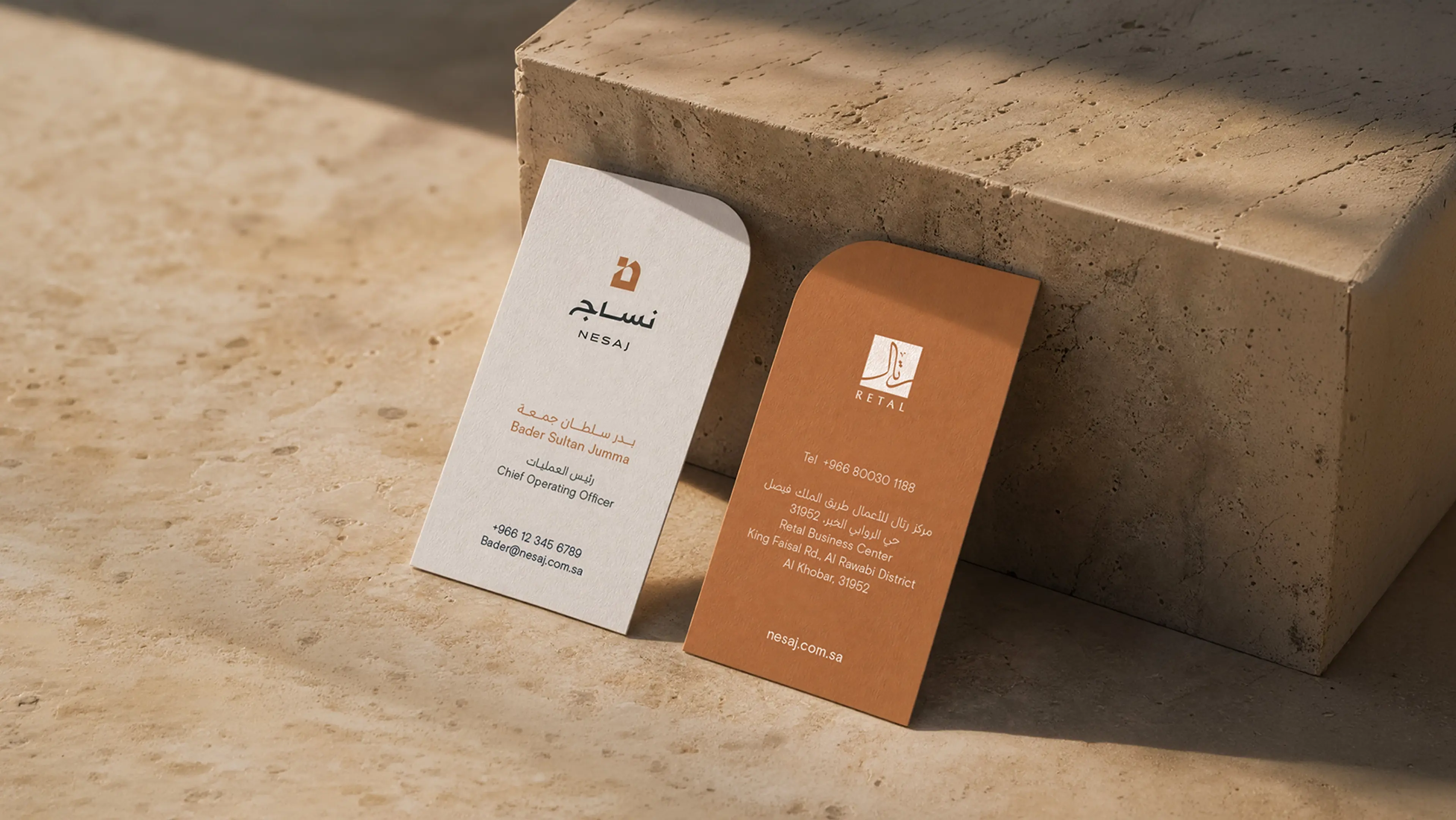
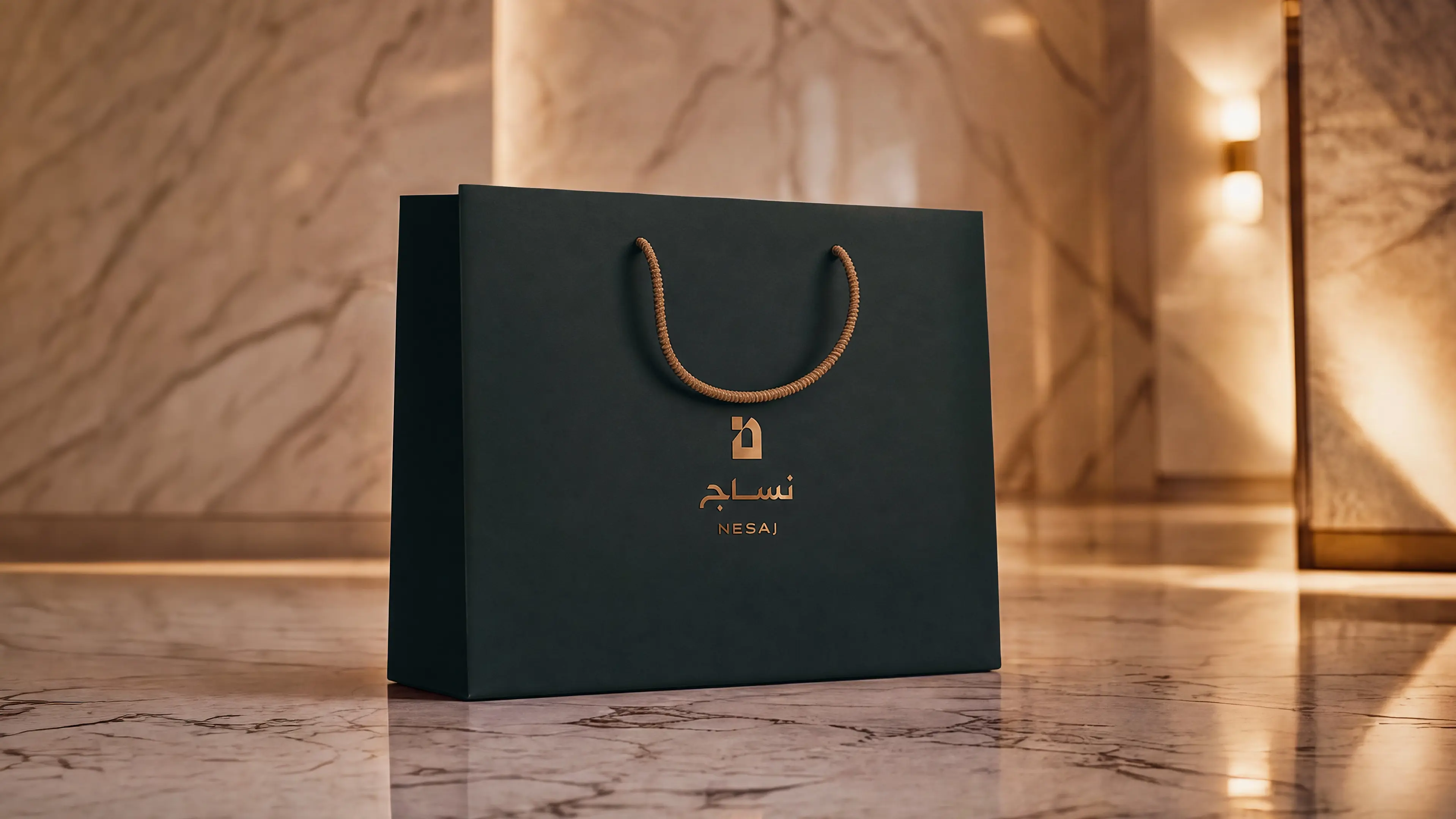
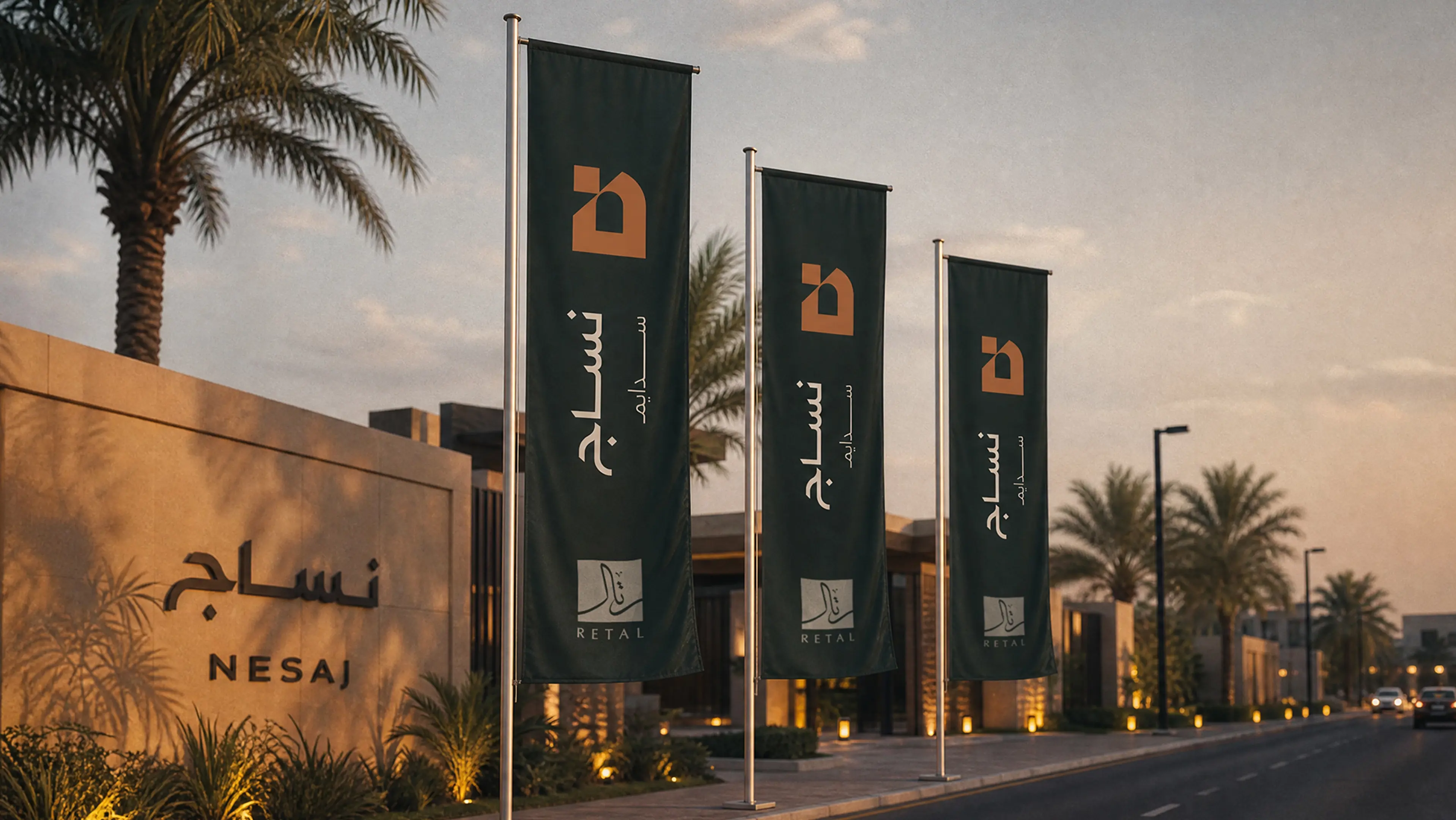
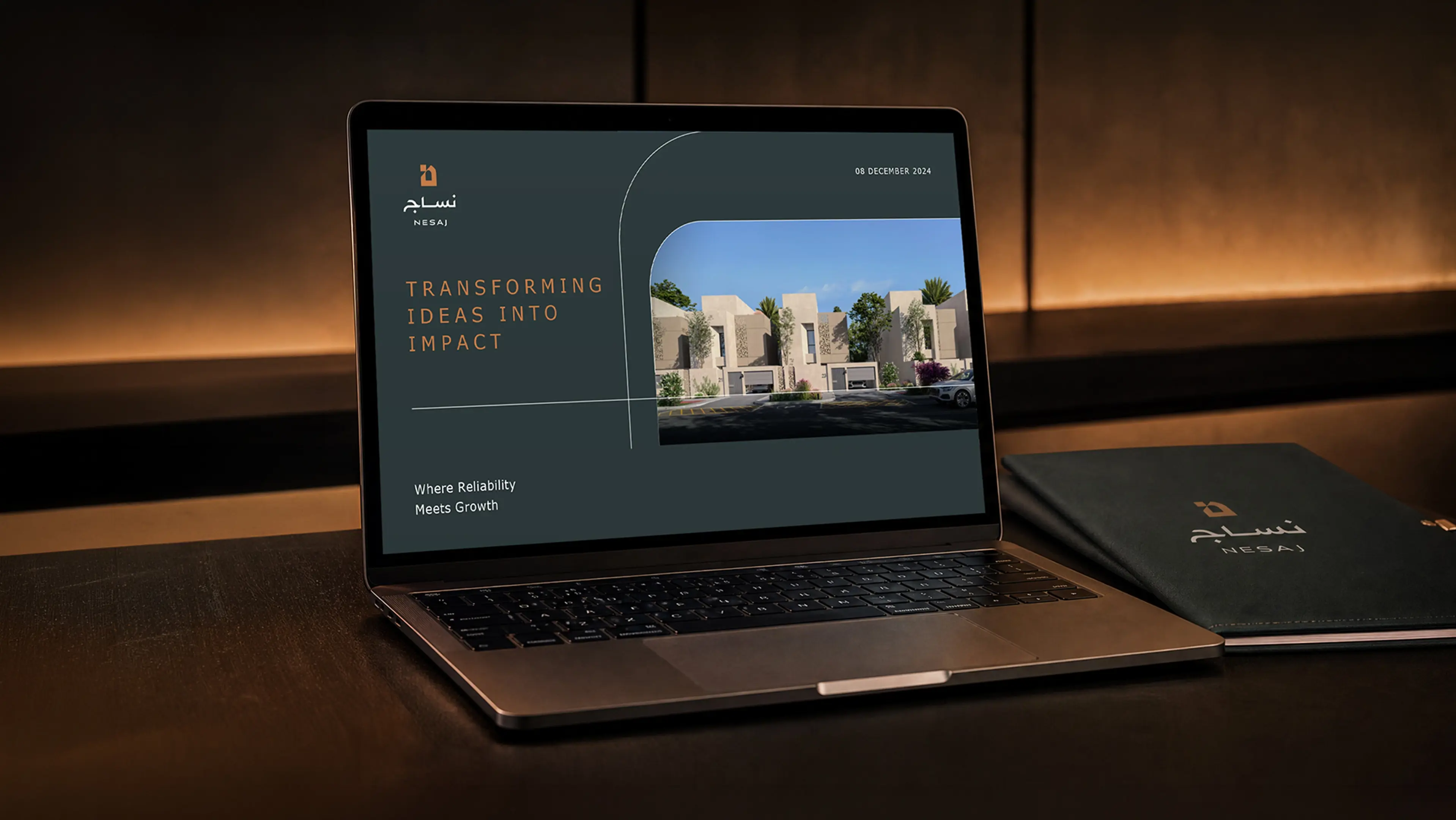
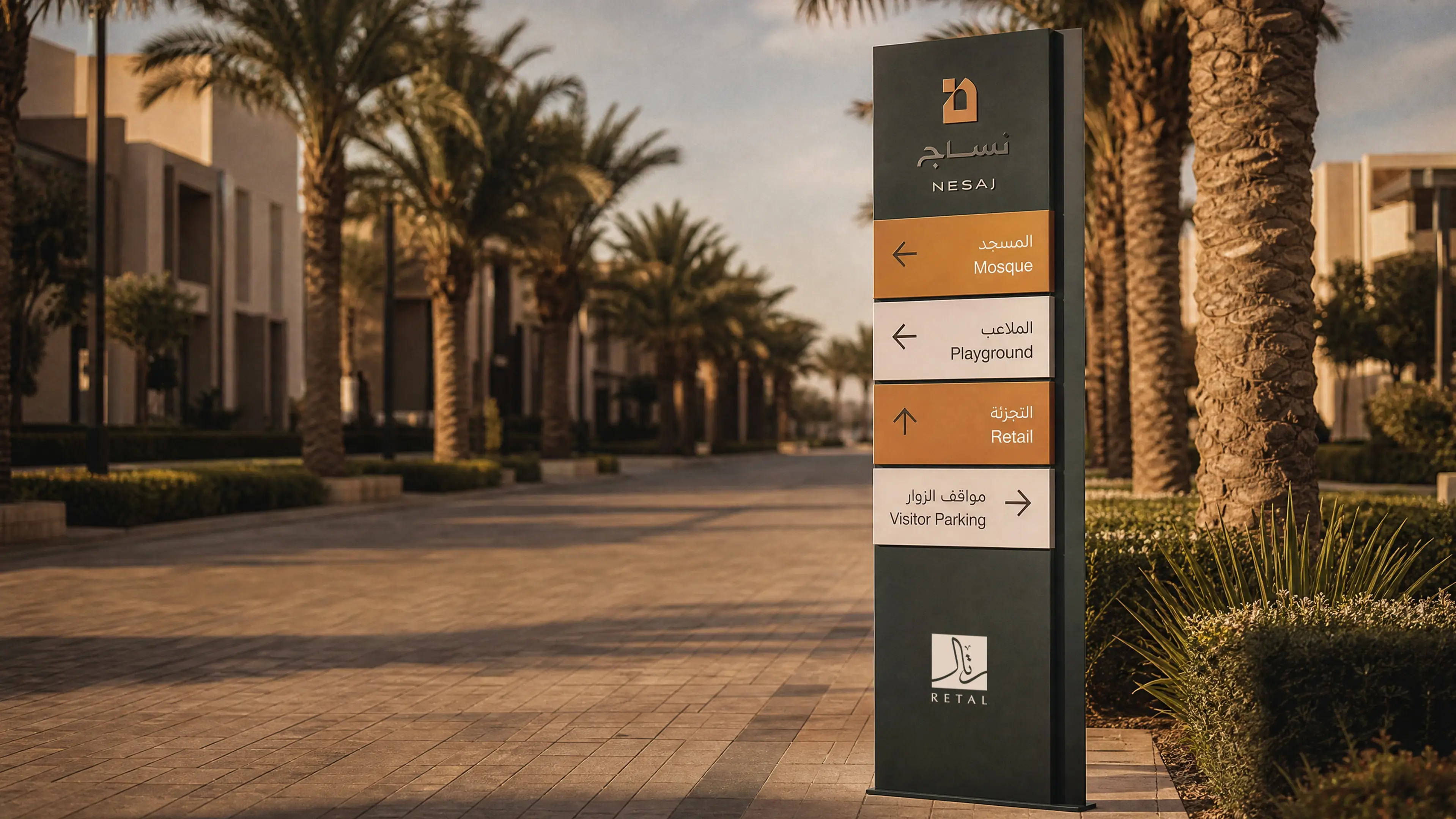
The brand’s visual identity was seamlessly integrated across a comprehensive range of physical and digital touchpoints to ensure consistency and professional authority, from corporate stationery to tailored email templates and social media themes.
Brand Guidelines
We established comprehensive Brand Guidelines to safeguard the Nesaj identity across all future applications. This manual provides a robust framework for internal and external communications, defining precise colour palettes, typography hierarchies, and layout principles.
Design
Publications Design
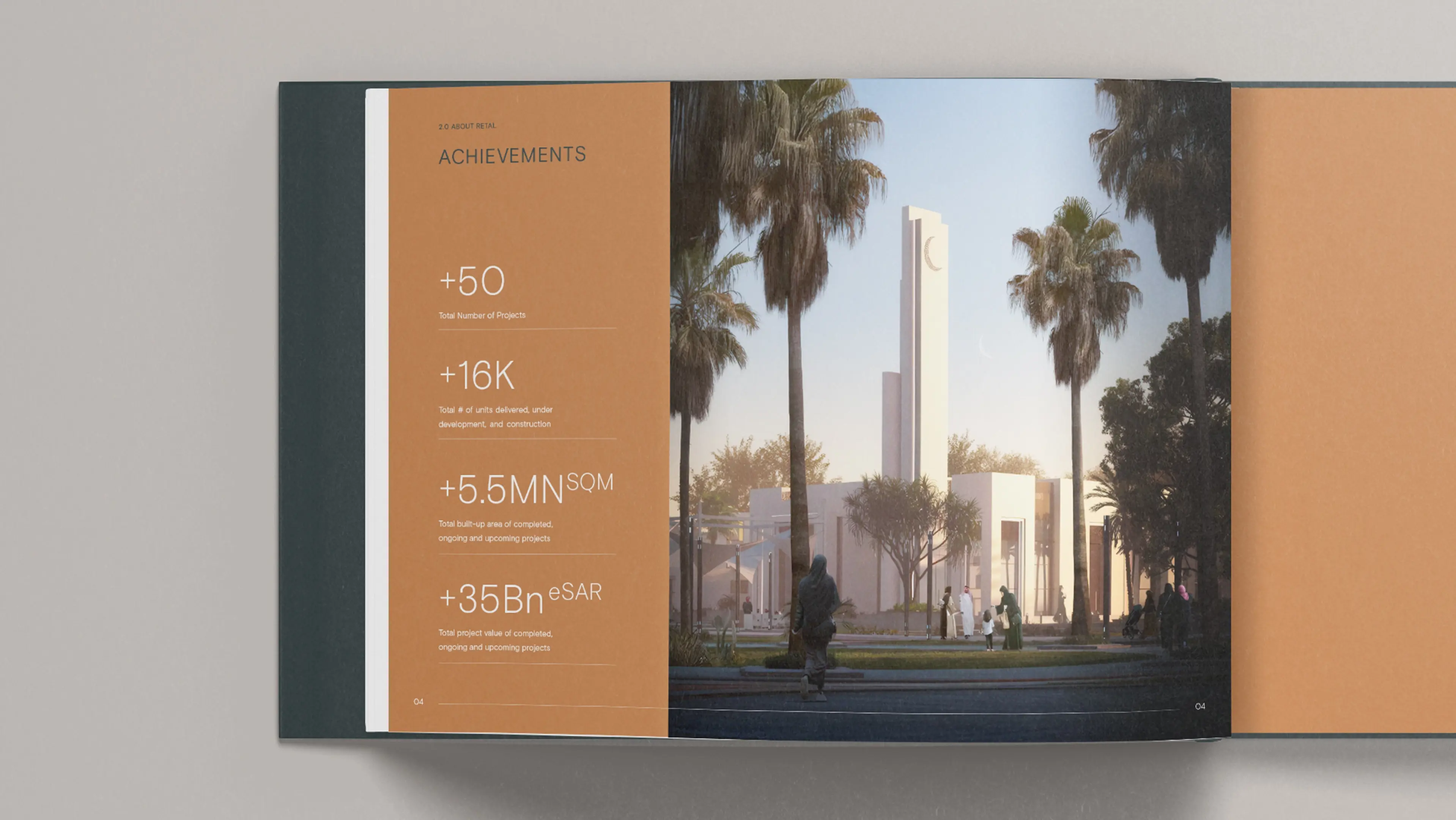
To effectively showcase Nesaj’s high-quality offerings, we developed a sales brochure template designed to serve as a foundation for future projects. It clearly communicates each development’s value through engaging themes that blend cultural heritage with modern design, presenting key information in a compelling and accessible way.